
Creating a corporate identity: the stages of working with WonderWeb
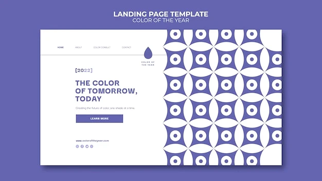
A corporate identity is not just a visual “texture”, but a strategic tool that reinforces the visual DNA of a brand at every point of contact: from the website and presentations to packaging and merchandise. At WonderWeb, we combine corporate identity development, thoughtful branding and identity, and logo design to create patterns that work for recognition and conversion 💡
🎨 What is a corporate pattern and why does a business need it?
Role in branding and identity
The pattern strengthens the identity system: it scales, rhythmically combines media, and helps to distinguish yourself even without a logo. This is especially valuable in digital, where user attention is limited ⏱️
- Recognizability: repeated motifs form the memory of the image, increasing recall by up to 20-30% in complex campaigns, according to Nielsen.
- Consistency: the pattern structures layouts without overloading, supports the hierarchy of content, and is readable on different media.
- Versatility: a properly designed motif works in web, print, video, and interfaces 📱🖨️
How the pattern enhances digital channels
A common visual language improves user experience and campaign metrics. The pattern is especially useful when you scale your marketing mix.
- Interface design: responsive motifs harmoniously complement website design and improve readability.
- Web projects: the pattern is optimized along with website development – without losing performance.
- Traffic and media: recognizable visuals support SEO promotion, Google ADS contextual advertising, smm promotion, and targeted META ADS advertising 📈
🧩 Stages of creating a corporate pattern with WonderWeb
Research, brief and basic system
We start with a short workshop, competitor and audience analysis. We agree on semantic markers, shape, texture, and rhythm. If necessary, we update or refine the basis: logo design and corporate identity development. This is how we guarantee integrity, where branding and identity do not conflict with the pattern 🧠
- Analytics: tasks, audience, media, KPIs; we validate hypotheses.
- Shape and modules: we define geometry, grain, scale of repetition.
- Colors: palette, contrasts, adaptation to dark/light themes.
Sketches, modular grid, and testing
We develop several directions – from minimalistic to expressive. We build a modular grid and test it on real layouts – website, presentations, social creatives ✍️
- Sketch series: 3-5 concepts with different rhythms and densities.
- Prioritization: joint selection of 1-2 final directions.
- Accessibility tests: contrast, scale, texture for different screens.
Guidelines and export to formats
Finalize the rules of use, add use cases and warnings. Next, we prepare it for web and print ✅
| Format | Where to use | Preferred format |
|---|---|---|
| SVG | Web, interfaces | Vector, file weight is minimal |
| PNG | Social networks, presentations | Transparency, fast embedding |
| Printing, polygraphy | Color accuracy, scalability | |
| AI/PAT | Editing by designers | Flexible editing |
- Guidelines: proportions, margins, scales, bans.
- Asset package: formats, web preloads, post templates.
- Передача команді: інструкції для маркетингу й продакшенів 🧩
Disclamer: before printing, the color may vary depending on the material and profile; we calibrate according to ISO and conduct color tests.
📊 Standards, quality checks and examples
Facts and statistics
We follow the W3C recommendations for SVG performance, focus on ISO 12647 in printing and Pantone palettes for stable color reproduction. According to Nielsen research, consistent identity accelerates recognition and increases conversion in performance campaigns.
- Quality control: validators, testing on different DPIs and browsers.
- Accessibility: WCAG contrast, readability over pattern.
- Performance: minimization, sprites, lazy-load on the web 🧪
WonderWeb case study
For the e-commerce brand, we created a vector motif tied to the geometry of the logo. The result after integration: the time for recognizing creatives in social networks decreased by 0.7 seconds, CTR in cold traffic increased by 18%, and production costs decreased due to modularity ✨
- Pilot: A/B in advertising creatives and on website banners.
- Scale: adaptation to pages, emails, packaging.
- Documentation: video guides for the internal team.
Common mistakes and how to avoid them
Overcomplicated patterns, poor contrast, “seams” in tiling, lack of scaling rules. We prevent this with clear guidelines, unit tests, and proofs 🔍
- Simplification: less noise – better readability.
- Tiling: seamlessness, control of the repetition step.
- Flexibility: multiple pattern densities for different media.
🤝 How to choose a contractor and what we expect from clients
Criteria for choosing a studio
Evaluate not only the beauty but also the processes. A reliable contractor demonstrates methodology, metrics, testing, and integration with marketing.
- Portfolio: availability of system cases, not just “pictures”.
- Process: research, prototypes, test packages, guidelines.
- Integration: connection with website design and development, support of advertising channels.
State of the service market and niche issues
Today, many brands launch campaigns without a coherent system: different media styles, competitors’ copies, overloaded backgrounds. This affects the effectiveness of advertising, complicates SEO promotion, and reduces the ROI of the performance. The optimal way is the only guidelines that work in tandem with Google ADS contextual advertising, smm promotion, and targeted advertising META ADS 🚀
- Problem: random visual mix in creatives.
- Consequence: loss of recognition and budget.
- Solution: systematic pattern + application control.
Clients who are interesting to work with
The best results are achieved by partnering with teams that are ready for transparent analytics, rapid iteration, and joint testing. We value experimenters and businesses with ambitions to scale 🌟
- Openness: data, access, hypotheses.
- Fast cycles: short sprints, clear feedback.
- Focus on quality: long-term value, not a “one-time banner”.
Bottom line. A branded pattern is a useful asset that strengthens each medium and accelerates growth. If you’re preparing for the seasonal wave of Back to School, back to school and the new school year is a great opportunity to clean up your visual system: design a corporate-style class schedule, refresh creatives for stationery and student shopping, and create warm digital attributes for school accessories. Let WonderWeb develop a pattern that will make your brand fall in love with you at first sight – from landing pages to promotional creatives 🧡 Check out the details of the services on the website and leave a request: we will show you where to start, how to integrate the pattern into your back-to-school marketing campaign, and choose the best package. Ready to get started? Write to us and let’s pack your uniqueness into a systematic visual code.
||| , meta_title: ||| Corporate identity: stages of creation | WonderWeb


