
Secrets of creating effective infographics
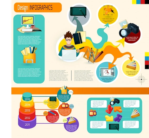
In today’s world, where information competes for user attention, visual content has become an indispensable communication tool. Infographics are a powerful way to convey complex data in a visually appealing and understandable way. It not only improves the perception of information but also significantly increases audience engagement. Professional website design often includes infographics as a key element that helps users absorb information faster. Creating effective infographics is an art that combines analytical thinking, creativity, and an understanding of the psychology of perception. Let’s look at the main secrets that will help you create infographics that attract attention and effectively convey your message.
🎨 Basic principles of developing effective infographics
Before diving into the technical aspects of creating infographics, it is important to understand the fundamental principles that make them effective. High-quality website design always takes these principles into account, because they are universal for any visual content.
Clarity and conciseness of the message
An effective infographic always has a clear goal and focuses on one main idea. Trying to squeeze too much information into one infographic is a common mistake for beginners. According to statistics, infographics with a clear focus receive 30% more interactions than images overloaded with data 🧠. When you are planning a web design, remember that each visual element should work to achieve a specific goal.
- Define the key message – before starting work, formulate one sentence that conveys the main idea
- Filter the data – use only those that directly support the main idea
- Structure the information – ensure a logical flow of data from start to finish
Visual hierarchy and balance
Visual hierarchy determines how the user perceives information and in what order. Professional website design always takes this aspect into account. Interesting fact: studies show that human eyes move across a page in an F-shaped or Z-shaped pattern, depending on the type of content 👁️.
| Hierarchy element | Function | Example of use |
|---|---|---|
| Size | Draws attention to important elements | Larger heading, smaller subheading |
| Color | Accentuates and groups information | Bright colors for key data |
| Contrast | Separates elements from each other | Dark text on a light background |
| Space | Allows information to “breathe” | Indents between data blocks |
When ordering a website design service, the price often depends on the complexity of the visual hierarchy and the number of elements that need to be balanced. Professionals know how to create harmonious compositions where each element is in its place.
📊 Technical aspects of creating infographics
After defining the concept and structure of the infographic, it’s time for technical implementation. This phase requires both creativity and technical skills, especially if you plan to integrate infographics into website development.
Choosing tools and software
There are many tools for creating infographics on the market – from professional graphic editors to specialized online platforms. The choice depends on your skills, budget, and the specific needs of the project 🛠️.
- Professional graphic editors
- Adobe Illustrator – a powerful vector editor
- Adobe Photoshop – ideal for working with raster graphics
- Online platforms
- Canva – a simple interface with many templates
- Piktochart – a specialized tool for infographics
- Specialized tools for data
- Tableau – for complex data visualization
- Infogram – for creating interactive graphs
It is worth noting that when ordering the website design service, the price may include the cost of licenses for the use of professional software that ensures high quality of the final product.
Optimization for different platforms
Modern infographics should look good on different devices and platforms. This is especially important for SEO promotion, as the adaptability of content affects search engine rankings 📱.
- Sizes and formats
- Horizontal infographics (800×2000 pixels) – for websites
- Vertical infographics (1080×1080 pixels) – for social media
- File formats
- PNG – for web graphics with transparency
- JPEG – for photographic elements
- SVG – for scalable vector graphics
SMM professionals recommend creating different versions of infographics for different platforms to maximize their effectiveness and reach.
🔍 Psychological aspects of effective infographics
Understanding the psychology of information perception helps to create infographics that not only attract attention but also convey messages effectively. These principles are actively used in Google ADS contextual advertising to increase conversions.
Use of colors and their impact
Colors play a key role in the perception of information and evoke certain emotions. Studies show that a properly selected color scheme can increase brand recognition by 80% 🎭. When developing a website design, the price often depends on the complexity of the color scheme and its psychological justification.
| Color | Psychological impact | Best used in infographics |
|---|---|---|
| Blue | Trust, calmness, professionalism | Financial data, corporate information |
| Red | Urgency, energy, passion | Calls to action, important warnings |
| Green | Growth, health, sustainability | Positive dynamics, environmental topics |
| Yellow | Optimism, clarity, attention | Highlighting key points, creative concepts |
It is important to keep in mind cultural differences in color perception when creating infographics for an international audience. This is especially true when setting up META ADS targeted advertising.
Typography and readability
The choice of fonts and their combinations significantly affects the perception of information. High-quality typography is an integral part of website design development, which ensures comfortable reading and assimilation of content 📝.
- Rules of effective typography in infographics
- Use no more than 2-3 fonts in one infographic
- Provide sufficient contrast between text and background
- Follow the hierarchy: title > subheading > body text
- Optimal font sizes
- Headlines: 24-36 points
- Subheadings: 18-24 points
- Main text: 12-16 paragraphs
According to research, infographics with optimal typography hold users’ attention 42% longer than those with hard-to-read text. This directly affects the effectiveness of SEO promotion and audience engagement.
💡 Practical tips for creating impressive infographics
Now that we’ve covered the basic principles and technical aspects, it’s time to move on to practical tips that will help you create truly impressive infographics. These recommendations are based on the real experience of successful web design projects.
Working with data and its visualization
The basis of any infographic is data that needs to be transformed into a visually appealing story. Website design experts recommend the following approach to working with data 📊:
- Collect and analyze data
- Use reliable sources of information
- Check the relevance of the data (not older than 1-2 years)
- Look for unexpected connections and patterns
- Choose the best graphic elements
- Charts – for comparing values
- Graphs – to show trends
- Maps – for geographic data
- Timelines – for chronological sequences
Interesting fact: studies show that the brain processes visual information 60,000 times faster than text. That’s why high-quality data visualization is the key to effective communication 🧠.
Storytelling in infographics
The most effective infographics tell a story, not just present a set of facts. Creating a narrative is an art that is actively used in website design to increase user engagement.
- The structure of a story in an infographic
- Introduction – define the problem or issue
- The main part – present data and analysis
- Conclusion – offer a solution or call to action
- Emotional triggers
- Use contrasting comparisons
- Include relevant quotes from experts
- Add elements of surprise or discovery
When ordering website design services, the price often includes the development of a storytelling concept, which significantly increases the effectiveness of communication with the target audience.
Creating effective infographics is a complex process that requires both technical skills and an understanding of the psychology of information perception. By applying the principles described in this article, you will be able to create infographics that not only attract attention but also effectively convey your message to the audience. Remember that high-quality web design always includes visually appealing elements that help users better understand and memorize information.
If you want to create truly impressive infographics for your business, the WonderWeb team is ready to offer professional website design services, including the creation of unique infographics that meet your business goals. Contact us today to discuss your project and get a personalized consultation!!!!

